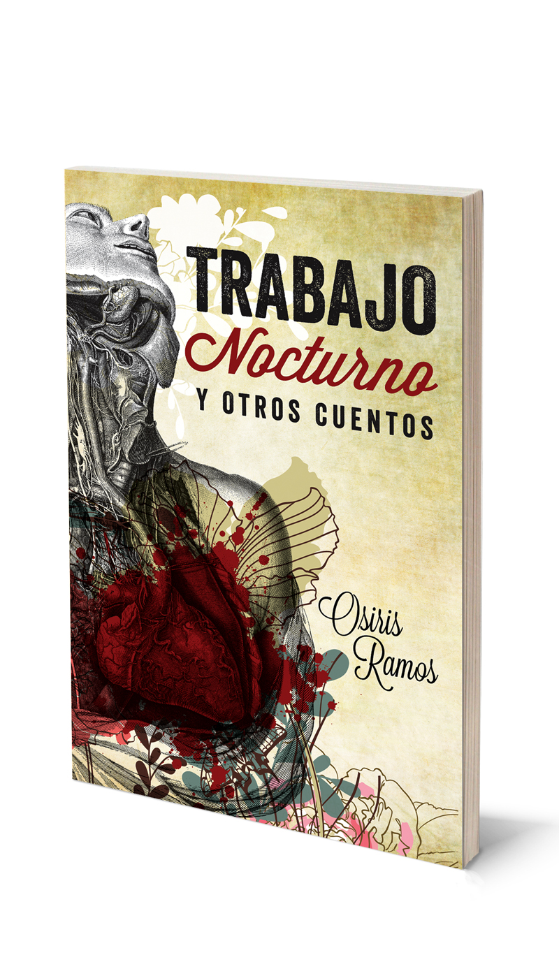
I began by working with the author, Osiris, to create a word-mark for the title of the book. She explained that it was a complicated collection of stories that had both extreme fragility and at times a very cold and removed narrative. I chose to represent that in a blocky sans-serif font that was also slightly degraded to represent the cold, yet weary aspect of the stories and the slightly thick cursive to represent the fragility without making it feel weak the way that the fragility in the stories is represented as a kind of strength in and of itself.
The book was targeted for the Mexican market so I did some research and consulted the author and came up with powerful strong imagery that was also colourful.