Research
The Mockup
Illustrations
Desk Image
For the rest of the illustrations, I tried to use visuals that were in line stylistically with the original image and maintained the same colour scheme as outlined in the branding guidelines.
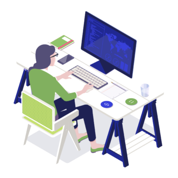
I chose to use an image of a person checking code on a computer because I felt it was important to add a personal element and to show a person using the software. Even in an illustration format, seeing a person using the product will make it feel more personal and user-friendly.
Main Image
For the illustrations, I chose one of the original images provided for the main product image, as I felt it reflected well the concept of the use different versions. The only thing I adjusted were the colours to have them fit with the blue and green colour theme, and I left the one pop of colour with the pink, orange, yellow and green levels to emphasize the different versions visually.
Computer Image
For the illustration of the computer with the different versions, I created a similar illustration to the one provided in the branding document, but I modified it to follow the style that was used for the main (and subsequent) images.